Into Drakain
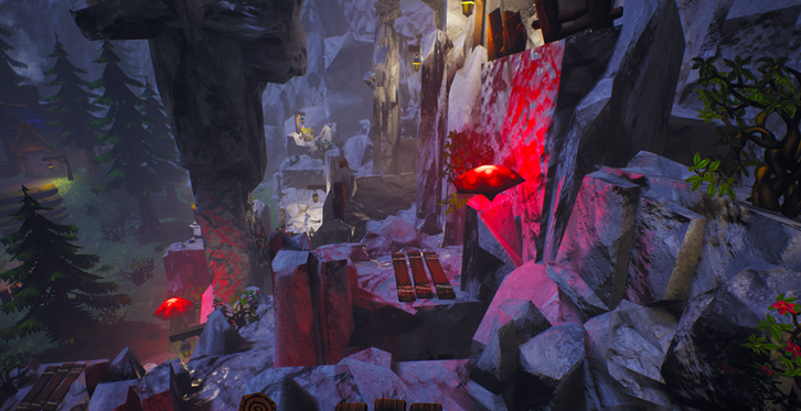
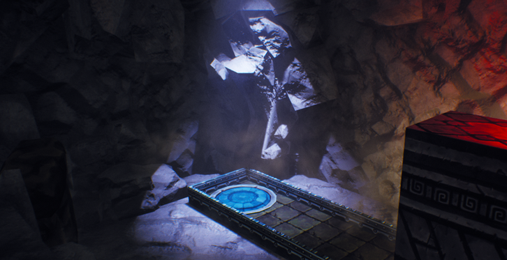
Into Drakain is a third person platformer where you control Noju, a girl on a mission to leave her town by jumping through the mountains, solving life threatening puzzles, and fighting monsters in order to save her home town from the Raar, the powerful skeletons kings rule.
The Goal of this project was to design a level inside a few certain restrictions.
-
The overall perimeter cannot exceed 12000uu
-
The level must feature a platforming, puzzle, and combat section.
-
A unique landmark must be present in the design of the level.
-
In total the level takes 10 minutes to complete.
With the criteria in mind I began to design my level with a personal goal in mind aside from the requirements. Make sure that when the project is finished, I've learned how I could've done it better initially. What I mean here is I want to learn and improve techniques throughout this project so that if I were to come back and re-do it, I could achieve a better result.
While making this level, I really wanted to focus on a few things.
-
Directing the player.
-
Immersive environment.
-
Platforming freedom.
I wanted to do whatever I could to fulfill my personal 3 goals as they were a few tasks that have been interesting me in level design since the beginning of learning what the medium was.
-
I really liked how Uncharted made it seem so effortless to direct the player perfectly.
-
I loved how thorough and exciting the worlds were in Battlefield and Ghost of Tsushima.
-
I like how Celeste it seems like you could replay a level a couple times and complete it differently each time.
I wanted to try my hand at achieving and understanding what it would take to even get a fraction of the way to developing a level that can stand on par with these games.

Directing the Player
Ideas aren't transferred between minds easily. Messages get misinterpreted all the time resulting in confusion between the two parties. The good part is things can be intuitive by others if designed properly. My goal for this project is to make a level that is understood through gameplay by utilizing good level design.

Technique One - LIGHT
I found that light is one of the easier ways to direct players.
-
Light attracts players to its position.
-
Eyes are more attracted to light over flat backgrounds.
-
Light stands out.
The purpose of using light to help direct the player was to cover many bases with less assets. Along with attracting the player, light sources serve as the primary way to illuminate the gameplay space. Alongside directing the player, light sources were also making the world brighter so walls, textures, and obstacles were visible to the player during gameplay.
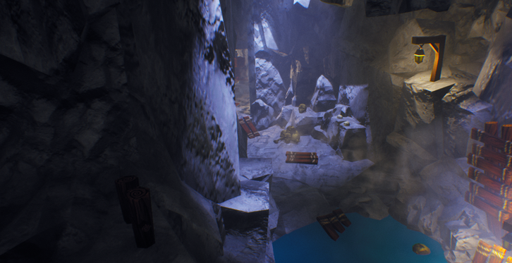
Beams of lights shine down illuminating areas that are important for the player. I liked how these beams helped players find places of progression, and they also fit the theme nicely. Normal light sources like lamps, or assets with illumination built in are placed in spots that also have an effect on gameplay and draw the player in.

Technique Two - Colours
Mirror's Edge and The Uncharted Series utilize colour to direct players very well. Helping the player associate a certain colour with progress is a great way to guide player throughout levels as seen in both hyper successful games.
The way I approached this technique was to grab a fairly inoffensive assets and direct the players movement towards it.
I chose this board

Just a simple board would do the trick for my level since this board met some of my criteria.
-
Fit within the worlds setting.
-
Contrast from the rocky, grey cliffs.
-
Be versatile with its placements.
Luckily this board fit every category pretty well so I decided that it would be the asset to help in my quest to direct players properly.
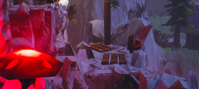
Now this board became very versatile. Placing it on the ground was an easy way to leave a crumb trail, placing it on a far away object in line of sight was an easy way grab the attention of the player, placing it beside key obstacles and interactables was a way to give a helpful hint.
A few examples.
-
Using the boards and lights in the players line of sight in order to draw them towards it.
-
Placing the boards rotates and pointing towards another direction to have players loop around a corner.
-
Using boards to block sections off and direct the player along the wall instead.
I was making sure to not just throw assets all over the place without a bit of meaning behind them. I wanted to create the sense of realism as much as I could. Using a normal wooden board I felt wouldn't break immersion from the game as much as a solid blue block would.
Looking back on the project, I do feel that the wooden board could have been a bit more unique to the environment. Something along the lines of changing its colour to be a slightly different shade, but for this project it served its purpose. Most of my playtesters had noticed the repetition of this asset and began to associate it with the places they had to go. It helped many of them complete sections that were slightly confusing at a first glance, or even had them discover secrets that they didn't notice at first.

Technique Two - Mass and Void
Creating empty spaces within a lot of filled space is a good way to tell the player where to go. Often the spot that is more open catches the eye and attracts the player towards its location.
When the player goes to the space I want them to go to, I reward them with easier gameplay. Once they start to step foot into unproductive terrain I make it more difficult in an effort to get the player to remove themselves from the challenging terrain.
One of the spots I used this technique the most is in my boss fight at the end of the game.

Staying in the red
-
Less space to move around in.
-
Higher chance to take damage.
-
Trapped in the debris.
Staying in the green
-
More space to maneuver Noju.
-
Easier to dodge bosses attacks.
-
Initiate attacks from multiple angles.

Immersive Environment
Environments are meant to wrap up an experience into a believable space. It doesn't have to be believable in our world, just the world it's being created for. I set out with a goal to create a realistic fantasy world situated in my valley village theme. Combining real world ideas with imagination I began to sculpt out my visions for The Valley of Vorah.

Valley of Vorah
When I walk outside, what makes the world feel real?
My first task was to answer this question, and I settled on a reason that made the world feel like a real place to me:
Even without people around, the world still felt like people lived here.
Walking outside you can see traces of human life everywhere.
-
Coffee cups filling up garbage's.
-
Packages on front porches.
-
Shoes left on telephone wires.
Each of these actions had a living person on the other side of the decision. If I wasn't the one to do it, someone else had to have.
My goal was to replicate this feeling in The Valley of Vorah using actions that fit the setting. Create scenes with actions that the player didn't have any effect on, but something else living had to have had an effect on. This creates the sense of a real world that had life before you even decided to show up.

Stairs the player never broke. It has to be something else.

A fresh order of new stock the player never ordered themselves.

Chests the player themselves didn't place here.

Human skulls. The player still has a skull so it can't be theirs.
The other big goal of an immersive world was to keep the world consistent.
-
Stick to the theme of the world.
-
Keep assets the same as their duplicates.
-
Keep frequently traveled sections void of clutter.
Sticking to my goals and ideas allowed my world to come together as a whole instead of fragments of many worlds merging together.

Platforming Freedom
In a typical section that requires the player to platform across multiple peaks you will follow a linear path. Sometimes there are secret ways or changing paths to find a bit of loot, but most of the time it's a single linear path.
Now making one linear path is usually not a bad design idea, it works a lot of the time and creates some great gameplay, but I wanted to create a section where you can change your path and try out a different route at any point in the section.
My reasoning for choosing this way to do platforming was the following.
-
I knew I was able to do a simple linear platforming sections as I've done them before.
-
I wanted to challenge myself to do platforming in a more unique way.
-
Multiple paths fit the "mountainous terrain" setting of my project.
-
I wanted players to feel like they are progressing no matter the direction they go.
-
I can encourage exploration by placing loot in different locations around the platforming.

Red - Represents the main, and easiest path for the player.
Blue - Represents an optimal route that may result in a faster completion, or treasure.
Nowhere is detrimental to your progress because as long as you stay on the mountain the path will always lead you towards the end goal.

The mushroom here is intended to be used on the black arrows. Once used you can continue on your way forward.
But if you turn around, you can actually follow it again along the blue arrows and get to a higher section in the level faster.
The benefits I noticed to designing my platforming this way was the following.
-
Players were able to test out different routes in order to find the fastest one.
-
In a small section of gameplay I was able to create a large amount of content for players to enjoy.
-
If one path was too difficult for a player to complete there was always an alternative that had the possibility to be easier.
-
I was able to showcase different forms of platforming in the same section (shown below).
-
Because there was many solutions the section had a lot of replayability.
I wanted players to feel like platforming was more than a mechanical challenge. I wanted it to be more about discovery and less about difficulty.

Was I Successful?
I personally believe that I was successful in meeting my personal goals.
Of course I wasn't reaching the standards of an industry professional just yet, but a few steps in the right direction did me a lot of good. I do believe that I made a lot of mistakes.
-
I cluttered the world with too many assets similar to my one asset that was designed to direct players.
-
Light sources were spammed a little bit too much throughout the world.
-
I used up a lot of space in the beginning that could have been used to design more gameplay.
None of these mistakes make me upset. I look back on them and laugh now that I've learned a little bit more and have the ability to correct them initially. Noticing glaring mistakes is a great sign to show myself that I've improved and would be able to destroy my younger self in a challenge if I could ever go up against that guy. I learned and I can confidently say that if I were to tackle this project again I could make it 10x better than the original.